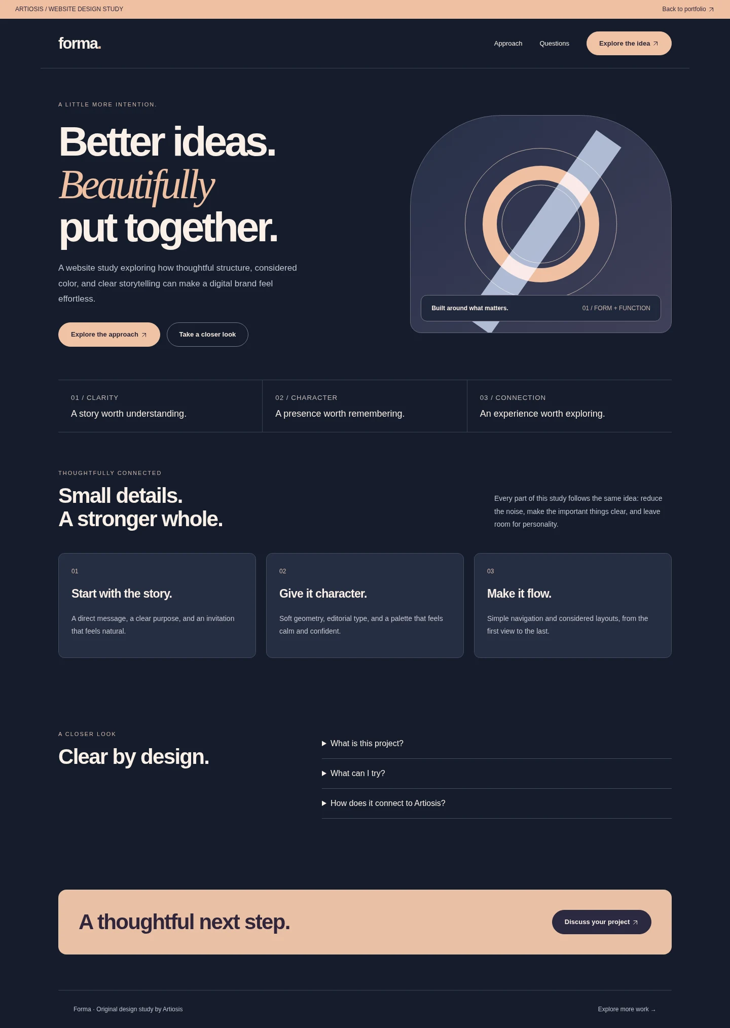
Forma / Web & UI
A little more intention.
A website experience pairing deep ink tones, warm peach accents, editorial typography, and a responsive page structure.
Original Artiosis design study. The interactive prototype demonstrates the interface using illustrative content; it is not presented as a commissioned client launch.
Try the interactive study 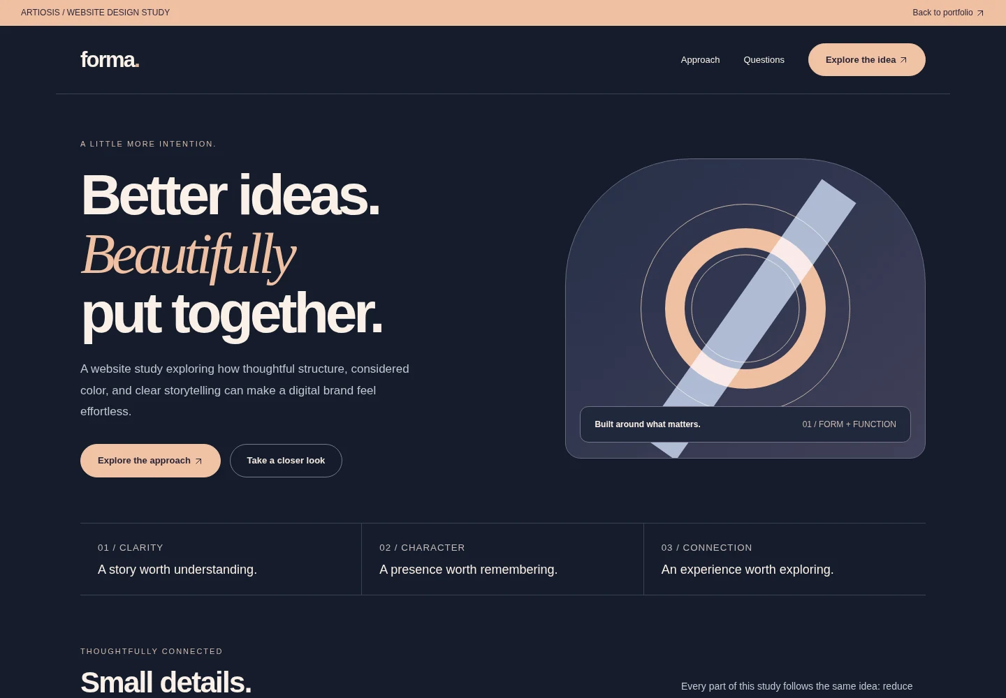
Design direction
A closer look.
Visual hierarchy and responsive layout with an ink-and-peach palette that complements Artiosis without repeating its colors.
Selected details
Desktop experience · Mobile experience
Desktop and mobile views of the original design study.